lo shu tea
Lo Shu is a conceptual brand for a range of wellness teas
brief
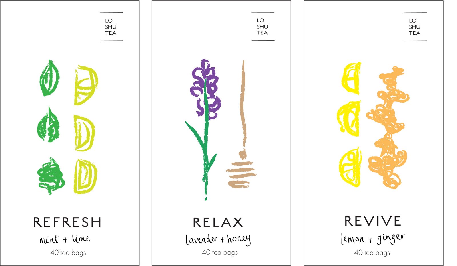
The brief was to create a healthy alternative to everyday tea that felt appealing rather than medicinal. The client wanted a fresh, contemporary identity that would stand out in a crowded market, moving away from the familiar colours, imagery and conventions often associated with wellness products
aim
The challenge was to make the tea feel good for you, without making it feel like medicine
idea
I wanted to create a tea brand that felt a little different from the usual wellness products. I came across the ancient Chinese legend of Lo Shu, which tells the story of a tortoise emerging from the River Lo with a mysterious pattern of numbers on its shell. I liked the idea that these numbers could represent different qualities and characteristics, and used this as the starting point for the brand.
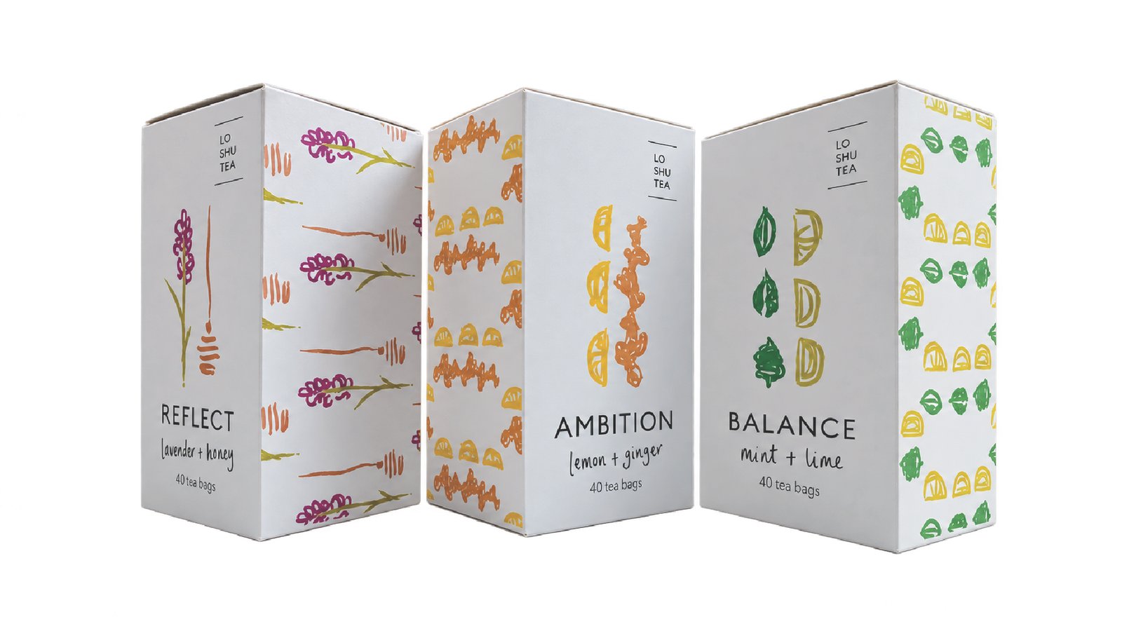
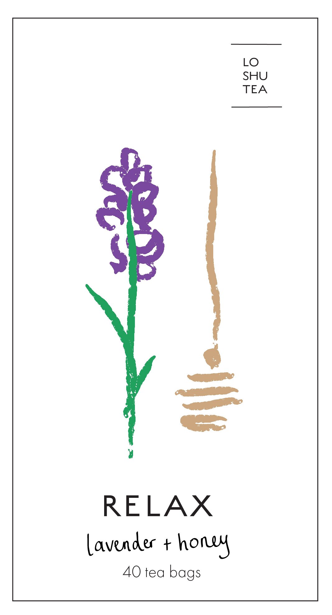
I developed three teas around the themes of Reflection, Ambition and Balance. I used loose, hand-drawn illustrations, bright colours and simple typography to give the packaging a contemporary, approachable feel. I wanted the finished boxes to look playful and distinctive, rather than clinical or overly serious.